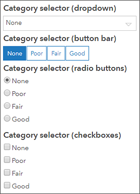
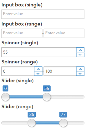
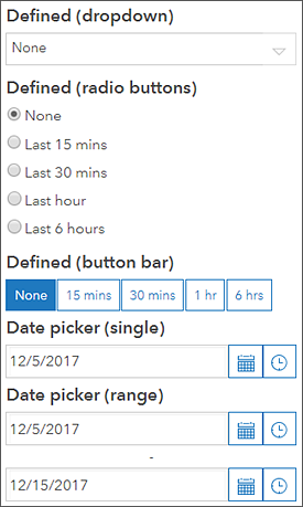
A selector describes any dashboard element that supports a selection change event. Since they support events, selectors can trigger actions. The list element and operational layers on a map can be considered selectors because you can select rows on a list, and you can select features from the operational layers shown on a map. However, this topic focuses on the category, number, and date selectors.
These selectors can only be added to the header and side panel. You add a selector to a header or side panel by hovering over it and clicking Add Category Selector  , Add Number Selector
  , or Add Date Selector
  .
.
You can configure selectors in various ways. On the Selector tab, you can specify properties specific to the element, such as the selector's title and how it's displayed, as well as the data or values on which it's based. On the Actions tab, you can specify the actions to be triggered by the selector.
Note:
The amount of vertical space selectors occupy in a panel can differ depending on how they are configured. Some selector configurations are not possible on the header because it has a fixed height. If you can't configure a selector a particular way on a dashboard header, try adding the selector to the side panel or choosing a different selector configuration.
After a selector has been added to a panel, you can change its settings by hovering over it and clicking Configure element  . You can also change the order in which selectors appear in the panel by clicking Move down
  or Move up
  .
.
The category, number, and date selector properties are described below.
Category selector
The categories in a category selector can be based on a list of static values, features, or summary statistics that are calculated at run time. Category selectors with categories derived from features can be used to apply a spatial filter.
The available preferred display types for this selector are dropdown, button bar, radio buttons, and checkboxes. If the number of values included in the selector exceeds the value of the Display Type Threshold setting, the display type default is dropdown to save space in the panel.
You can also specify whether users can select a single category or multiple categories simultaneously by adjusting the Selection setting. Optionally, you can enable the None Option toggle, which causes None to appear as a category in the selector, allowing you to have nothing selected.
If your selector is based on Grouped Values, the categories are automatically generated based on the field names in your data. You can change the display label for a category by clicking +Override, entering the category you want to change, and clicking Add. When your category is added, you can change its label.
To change the label for most of or all your categories, click Load Categories to add all the categories at once and edit their labels.
Number selector
A number selector can be based on a single fixed value or a numeric range. The available display types for this selector are input box, spinner, and slider. If you choose the input box display type, you can specify placeholder or hint text that appears in the boxes. If you choose the spinner or slider display type, you need to define the selector's upper and lower limits, which can be based on either defined values or statistics. For the spinner and slider display types, you can also set the increment by which values increase or decrease in the selector. 
Date selector
A date selector can be configured to show predefined date and time options, a date and time picker, or both. When the selector shows predefined dates and times, it can be displayed as a dropdown, a button bar, or radio buttons, the same options as the category selector. Also like the category selector, when you enable the None Option toggle, None appears as a category in the selector, allowing you to have nothing selected. You can also specify whether the first or last option is selected by default when you predefine the options.
When the selector displays the date and time picker, you can specify whether users can choose a single value from one picker or a range of values from two pickers. You can also control the default values for the date pickers.
When the date selector displays both predefined options and a date picker, the same settings are available for each type as when the selector only contains one type. The only additional setting is Label for Manual, which controls how the date picker is referenced in the display of the defined options.
