You'll take on the role of an investigative reporter looking for a lead on a story about hospitals in Clark County, Nevada. As you work through the steps in this lesson, you'll use the following skills: adding data to a map, choosing a different basemap, changing the style of the data symbols, customizing the information that appears in pop-ups, saving the map, and sharing the map with the public. This lesson is designed for beginners—anyone who is new to ArcGIS Enterprise, GIS, or web mapping. The ArcGIS Enterprise account you use to complete this lesson must be a member of a role that has privileges to create and share content. Estimated time: 20 minutes.
You're an investigative reporter who's been assigned to write about general acute care hospitals in Clark County, Nevada. It's up to you to find the interesting story. You've asked your intern to collect some basic data—where the hospitals are located, how many patients they see each year, and what they charge. From there, you'll see if anything interesting emerges that you can explore further. Your intern gives you a comma-separated values (CSV) file of the data and recommends that you use your organization's Enterprise portal. She says you can add the data to a map and quickly see patterns and make adjustments to better highlight the information. You can then save your work and share it with others.
Download data shared to a group
Your intern created a CSV file with information about general acute care hospitals in Clark County, Nevada. She shared the data with a public group in ArcGIS Online and sent you a link to the group. This way, you can access the data and see other related items she's shared with the group.
- Go to the group.
- Download the Clark County Hospitals CSV file to your computer and open it.
You see a table with columns of longitude, latitude, cases, name, cost, and so on. It’s hard to visualize where these hospitals are located or any patterns in the information. Making a map is a better way to understand your data than viewing it as a table, so that’s your next task.
- Close the CSV file.
Add a data layer to a new map and start visualizing patterns
Web map layers are the way geographic data is organized and combined to create maps. These layers are also the basis for geographic analysis. Seeing location-based information on a map is the foundation of understanding and making decisions. You can create a web map layer by adding your CSV file to a new map.
- Sign in to your ArcGIS Enterprise portal.
- At the top of the website, click Map to open Map Viewer.
- Click Add > Add Layer from File.
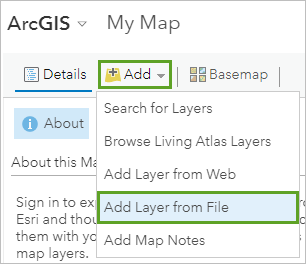
- Browse to the file you saved to your computer and click Import Layer.
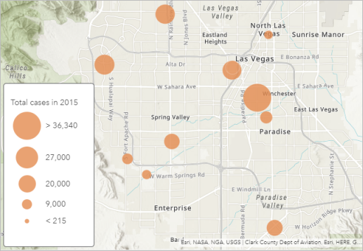
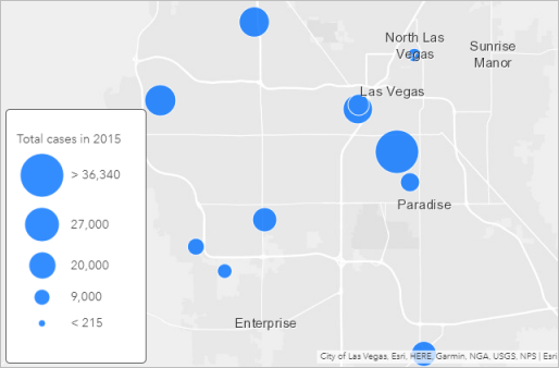
Map Viewer reads the geographic information in your file and displays the data so you can immediately see patterns. For example, you see different-sized circles and a legend that tells you the circles represent total cases in 2015. The larger the circle, the more patients that hospital admitted.
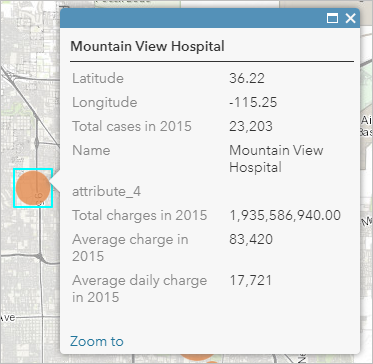
You also have quick access to the rest of your data by viewing pop-ups.
- Click any circle in the map to see the information from your dataset.
Change the basemap and layer style
The default Topographic basemap is better suited for a reference map than a thematic map. You'll change the basemap to something simpler.
- Click Basemap and choose Light Gray Canvas.
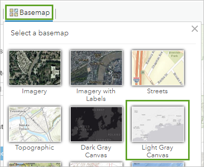
That’s better, but you want the circles to stand out even more so you’ll change the style by choosing a different color for your symbols.
- In the Change Style pane, for Counts and Amounts (Size), click Options.
- Click Symbols. Modify the symbol as follows:
- For Fill, choose a medium blue color (such as #0070FF).
- For Outline, change Transparency to 0%.
- Click OK.
- Click Done to finish changing the style of your layer and close the Change Style pane.
Configure pop-ups and view a table
The pop-up that you viewed earlier displayed unnecessary information that you can remove by configuring pop-ups. You want to show only the name of the hospital and the number of total cases.
- In the Contents pane, point to the Clark County Hospital layer, click the More Options button, and click Configure Pop-up.
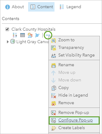
- Delete the text in the Pop-up Title field. For Pop-up Contents, change Display to A custom attribute display, and click Configure.
- In the Custom Attribute Display window, customize the pop-up display as follows:
- Click the Add field name button (circled in the image below), and choose {Name}. Type admitted with a space before and after it.
- Add another field name, {Total_cases_in_2015}, and type patients in 2015.
- Add bold formatting to the two field names.

- Click OK on the Custom Attribute Display window and click OK on the Configure Pop-up pane to save your changes.
- Click a circle in the map to see your refined pop-up.
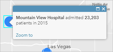
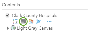
And don't worry, you haven't lost your data. You can still see it by showing the table for the layer.
- In the Contents pane, point to the Clark County Hospitals layer, click the Show Table button, and review your data.
Save the map and update the item details
Your map now tells a story about the location and size of hospitals in Clark County. For example, the hospital with the largest caseload in 2015 is located in Winchester, an unincorporated township that contains the Las Vegas strip. The hospital with the smallest caseload is in Boulder City about 26 miles away. You assume these size differences reflect relative population density in those places, but you'll want to add some demographic data to your map to verify that. For now, you'll save your map so you can share it with your editor when you present your story.
- Click Save > Save As.
- In the Save Map window, provide a title, tags, and a summary, and click Save Map.
Tip:
If your portal administrator has set up content categories, you can also select up to 20 categories to help others find your map. When assigning categories, you can use the Filter categories box to narrow the list.
By saving your map, you also created a corresponding item page that contains a variety of information, actions, options, and settings.
- In the Contents pane, click the About this Map button. Click More Details to open the item page.
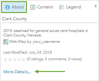
Your map’s item page opens in a new window or browser tab. The item details are missing important attribution and descriptive information that you should fill in before you share the map. For example, you should give credit to the data providers.
- Next to Credits (Attribution), click Edit, and type Nevada Department of Health and Human Services, Center for Health Information Analysis (CHIA). Click Save.
- Close the item page.
Share the map
Eventually you’ll want to share the map with your editor as part of your presentation, but it’s not quite ready for that yet. You need to do some more work on it until a newsworthy story emerges. In the meantime, you want to share the map with your intern and one of your colleagues so that they can see what you’ve done so far and provide feedback on what to explore next.
The fastest way to share a map is to share it with your organization and send an email that includes a link to your map. In the future, you could also embed the map in your newspaper's website and create a web app including a story map with additional text, videos, images, and web pages to enhance your map.
- In Map Viewer, click Share.
- In the Share window, check the box next to the name of your organization. Copy the link to the map so you can paste it into an email to share with others.
- Click Done.
Next steps
Your intern was right. In less than 20 minutes, you created a map in your portal and have ideas to share and explore for your story about hospitals in Clark County. What’s next?
To find more scenario-based lessons, browse Learn ArcGIS. You can also visit The ArcGIS Book and The ArcGIS Imagery Book websites.