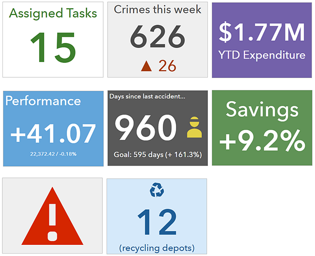
An indicator is essentially a card that can be added to your dashboard. It can be used to show the numeric attributes of individual features, or it can be used to display a count, a sum, an average, a minimum, or a maximum summary statistic. Additionally, it can be configured to compare its computed value to a reference value. Last, it can be configured to show an icon or change its color only in response to conditional thresholds being met. The following are some examples of the many configurations possible with an indicator:
As with many dashboard elements, the indicator has a title area, an area for the visualization, and a description area (for more information, see Configure an element). On an indicator, the area for the visualization can be divided into three areas: top, middle, and bottom. Each area is optional and can display text. This text can be any combination of the indicator's value, its reference value (if specified), a predefined list of calculations, or hard-coded text. As the indicator is resized, the text displayed in the top, middle, and bottom areas scales to fit the size of the indicator.
The predefined calculations available for an indicator are shown in the following table. They can be inserted into the top, middle, or bottom text fields by clicking Fields  .
.
| Description | Formula |
|---|---|
Calculated value | Value |
Reference value | Reference |
Difference | Value - Reference |
Absolute difference | |Value - Reference| |
Percentage | 100 * Value / Reference |
Percent change | 100 * (Value - Reference) / Reference |
Ratio | Value / Reference |
Ratio change | (Value - Reference) / Reference |
When specifying top, middle, or bottom text, HTML codes can be used. If you can't find a desired symbol on your keyboard, you can copy and paste it from another website directly into the text settings, or you can enter the symbol's decimal (dec) or hexadecimal (hex) reference code in these settings. For example, to include an upward pointing triangle (▲) in the indicator, you can insert its dec code of ▲ or its hex code of ▲ into the text settings. See Effective use of HTML for details.
The middle text is unique because it can have an icon displayed to the left or right of the text. These icons are scalable vector graphics (SVG) and, as with the text, will resize as the indicator resizes. If the provided SVG icons are insufficient, you can use your own. For more information, see Use custom icons.
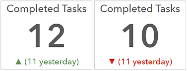
Reference values on indicators are optional and, when specified, can be thought of as a predefined goal or threshold. There are three types of reference values: the indicator's previous value, a fixed value set at design time, or a statistic calculated at run time. If you set a reference value, you can also configure conditional formatting for the indicator. Conditional formatting enables an indicator to display differently based on whether the current value is at or above the reference value or below it. In the following example, a red or green triangle is used to indicate whether completed tasks have increased or decreased, respectively, from the previous day's totals. 
You can also apply techniques such as value conversion, unit prefixing, and number formatting to the indicator. Finally, indicators can be used in interactive dashboards as the target of an action. This means that an action performed on another element, such as a selection on a list or a category selector, can control the data available to be displayed on the indicator.